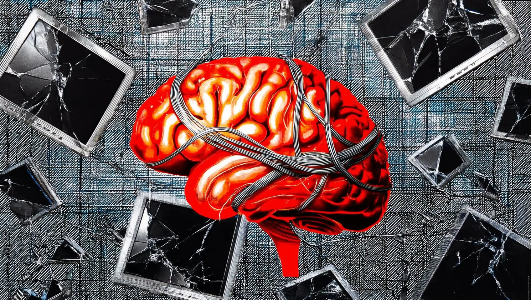
There is a quiet arms race happening inside every screen you own. On one side: the engineers, the optimisation teams, the engagement metrics. On the other: you, theoretically in control, theoretically choosing what to look at and for how long. The attention economy is not a metaphor. Your focus is the product being bought and sold — quantified in session time, in scroll depth, in return visits, in the milliseconds before you bounce.
Every notification, every red badge, every infinite scroll is an infrastructure built to extract value from the finite hours of your waking life. We are not passive in this. We return. We refresh. We open the app before the previous one has closed. Not because we are weak but because these systems were designed by people whose only job was to make them irresistible, backed by datasets of billions of human behaviours, refined over decades. This is not a fair fight.
People are beginning to name what they have lost: the long thought, the settled afternoon, the capacity to stay with something past the point where it gets difficult.
But something is shifting. The backlash is not against technology broadly — it is against the specific texture of attention it demands. Interrupted, fragmented, always-on, never quite here. People are beginning to name what they have lost: the long thought, the settled afternoon, the capacity to stay with something past the point where it gets difficult.
Design is partly to blame, and design is partly the answer. The relationship between form and reading is old. Typography has always been the management of attention — where the eye goes, how long it lingers, whether the thought survives the line break. A well-set page of text is a small piece of engineering, calibrated so that language can move from one mind to another with minimum friction. The great typographers understood that the reader's attention is the medium. Everything else is scaffolding.
Digital interfaces largely forgot this. Or, more accurately, they optimised for a different kind of attention: not the sustained, productive kind but the repeated, stimulus-seeking kind. Short loops. Variable rewards. The slot machine logic that keeps the thumb moving.
What would it look like to design the opposite? An interface that rewards staying. That becomes richer under prolonged attention rather than more anxious. That changes not to keep you from leaving but in honest response to whether you are truly here.
This page is an attempt at that. It reads a live signal from your prefrontal cortex — not your clicks, not your scroll velocity, not your time-on-page — your actual neural state, smoothed and interpreted, used not to sell you something but to let the page itself breathe in response. If you look away, it will change. If you come back, it will settle.
The irony is deliberate. An essay about attention that only holds its form while you attend to it. Whether that makes it more honest or more manipulative than the alternatives is a question you should probably sit with — which, of course, requires you to stay.
← Back to Journal